
 Edit this map

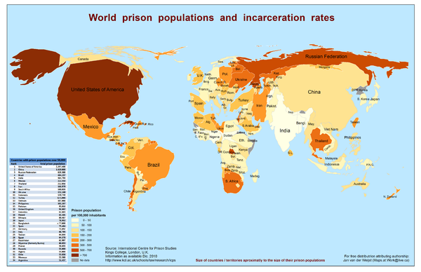
World Prison Population and Incarceration Rates Map
View Location
Technically this is a "bi-variate cartogram". It is a combination of a cartogram (country sizes scaled to their total -absolute- prison population) and a choropleth map (shading according to their -relative- incarceration rates, here per 100,000 population). A very sad map to be honest. These are not numbers but lost human lives. Although there my be many factors at play, it is clear that imprisonment is a culture. The highest levels of incarceration, intentionally, were placed at the bottom of the legend.

 See more

Nearby Maps
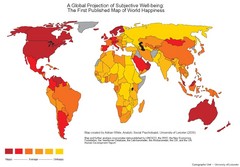
World Happiness Map
The first ever published map of world happiness...do with it what you will
0 miles away
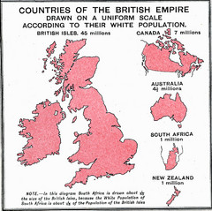
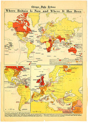
British Empire by Population Map
Guide to the British Empire by White Population, size of country determined by amount of white...
0 miles away
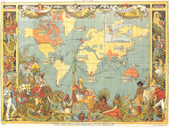
1886 British Empire Map
Guide to the British Empire as of 1886, beautiful illustrated map
0 miles away

 See more


 Explore Maps
 Map Directory
 click for
 Fullsize

0 Comments
New comments have been temporarily disabled.